About the Logo
Behind the Scenes
In our last blog post, we revealed our new brand name Claritas Studios!
In this post, I want to dive into the logo! This is for those of you who love behind the scenes and how things came to be. There was a lot of thought that went into the logo.
When thinking of a symbol for Claritas, or clarity, what came to mind was a flame. A flame can bring clarity both through illumination and also through purifying.

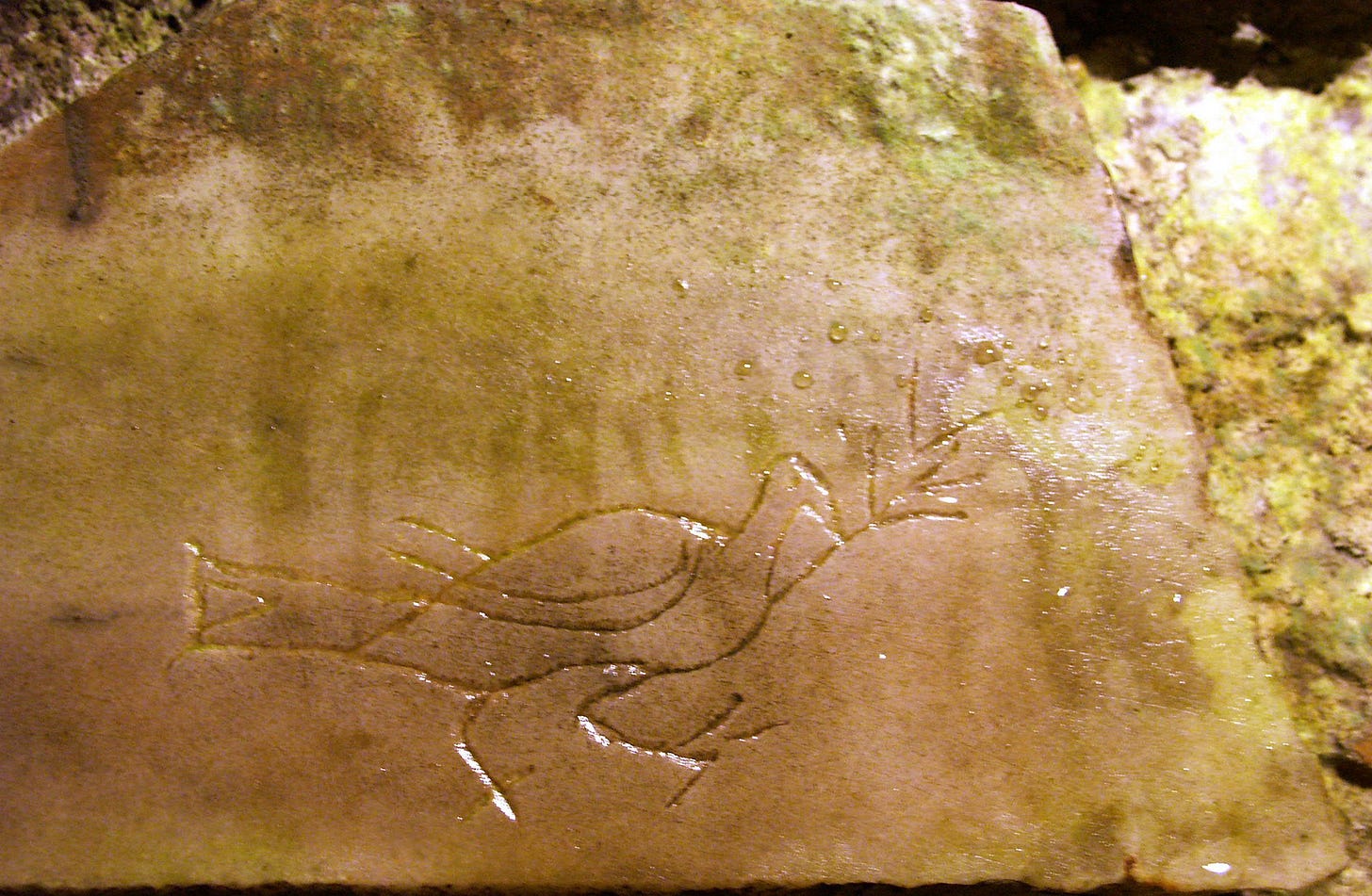
For any Catholic, the flame is representative of the Holy Spirit. We decided to try incorporating both the dove symbol and the flame symbol of the Holy Spirit. Yet, we wanted to make sure this is distinct from a Phoenix.
For the flame, naturally we had red in mind, then blue to represent the most intense flame. However, upon entering Mass one day and walking over to Mary to pray, a purple candle caught my eye. This little purple flame inside was beautiful! I thought this would be so fitting for us because purple is a color representing preparation which aligns with our mission of helping people of all ages for sainthood. So we changed the flame from blue to purple
Now, we have a flaming dove, but how did we want it to appear? When going through a book of Catholic symbols, an ancient symbol of seven flames came up. The seven flames typically represent the seven gifts of the Holy Spirit. So we made our dove with three flames on each wing, and have it’s head as the seventh flame. We also wanted the dove to be pointing up to heaven.
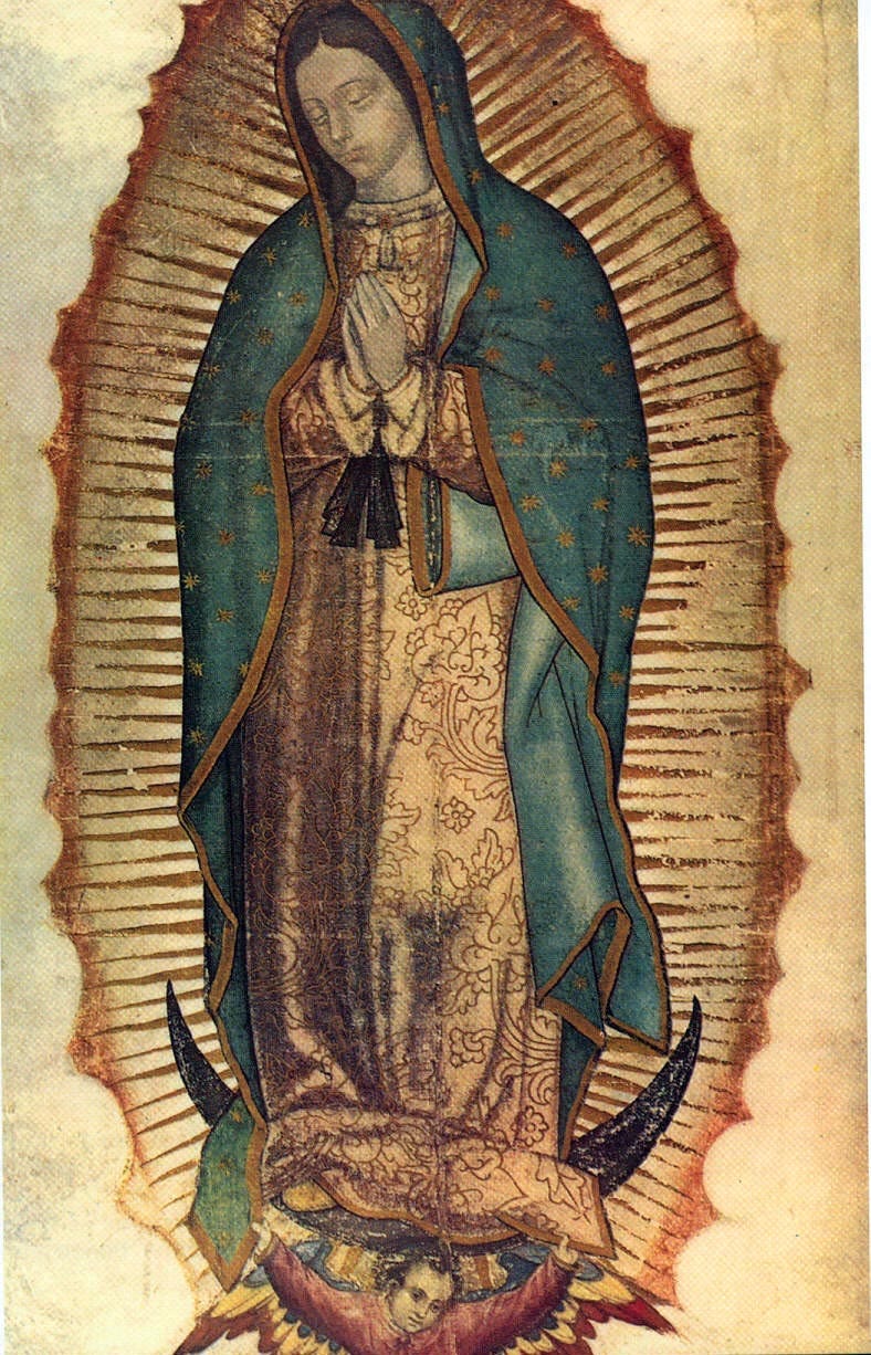
When designing the logo, we wanted to have the dove within the “C” of Claritas. The C quickly looked like an eclipsed moon. I loved this! It reminded me of Our Lady of Guadalupe, who is seen standing on the moon, eclipsing the sun. From the Aztec point of view, this showed Mary as greater than their moon god and greater than their sun god and had authority over their entire pantheon. For Catholics, the moon is seen as a representation of Mary, since she reflects the light of the Son to the world.
Lastly, we have the beautiful painterly texture. We are a company of Catholic artists and want to show that what we are doing is made by simple human hands who strive to serve the Lord.
Next week, we will post more details on our Instagram page on the color palette for this logo! A big thank you to Josh Martin for the logo illustration and Lindsey Bruno for the creative direction!
Until next time, God bless you!
In Christ,
Trevor
P.S. One week left of our Kickstarter fundraiser for our Saint Joseph animation!


